HR data tells you more about a business than almost any other function.
Turnover patterns predict problems before they hit revenue. Time-to-hire reveals whether recruiting can support growth plans. Compensation ratios flag equity issues before they become legal ones.
And yet HR dashboards are often some of the least usable reports in an organization — dense demographic tables, a dozen filters, and headcount numbers buried three scrolls down. The information is there. It's just not designed for the people who need to act on it.
This guide covers what makes HR dashboard design different from other reporting use cases, and how to build ones that leadership actually opens.
Why This Matters
HR dashboards serve an unusually wide audience. A CHRO wants a strategic view of workforce trends. A hiring manager wants to know if their open req is on track. Compliance teams need to verify demographic reporting accuracy. Line managers might just want to see their own team's attrition risk.
Designing for all of these audiences on a single, undifferentiated page is where most HR dashboards go wrong. The result is either an oversimplified summary that strategic stakeholders find useless, or an overloaded data dump that operational users can't parse quickly.
Getting this right matters because HR data, unlike sales or finance numbers, often carries sensitivity — compensation, demographics, performance ratings. Poor design doesn't just create confusion; it can create real governance and privacy exposure if the wrong audience sees the wrong level of detail.
Core Concepts in HR Dashboard Design
Audience-Based Layering
Rather than one page for everyone, effective HR dashboards layer detail by audience — an executive summary page, a manager-level operational page, and detailed drill-downs for HR analysts and compliance reviewers.
Sensitive Data Handling
Compensation and demographic data require deliberate design choices around row-level security, aggregation thresholds, and what's visible to which roles — this is a design decision as much as a technical one.
Trend Over Snapshot
Headcount and attrition numbers mean far more in context. A single "current headcount" figure tells you little; the same figure shown against a 12-month trend tells you whether the organization is growing, shrinking, or stable.
Actionable Framing
The best HR dashboards don't just report numbers — they frame them against benchmarks or targets, so a manager immediately knows whether 18% attrition on their team is normal or a warning sign.
Best Practices for HR Dashboard Design
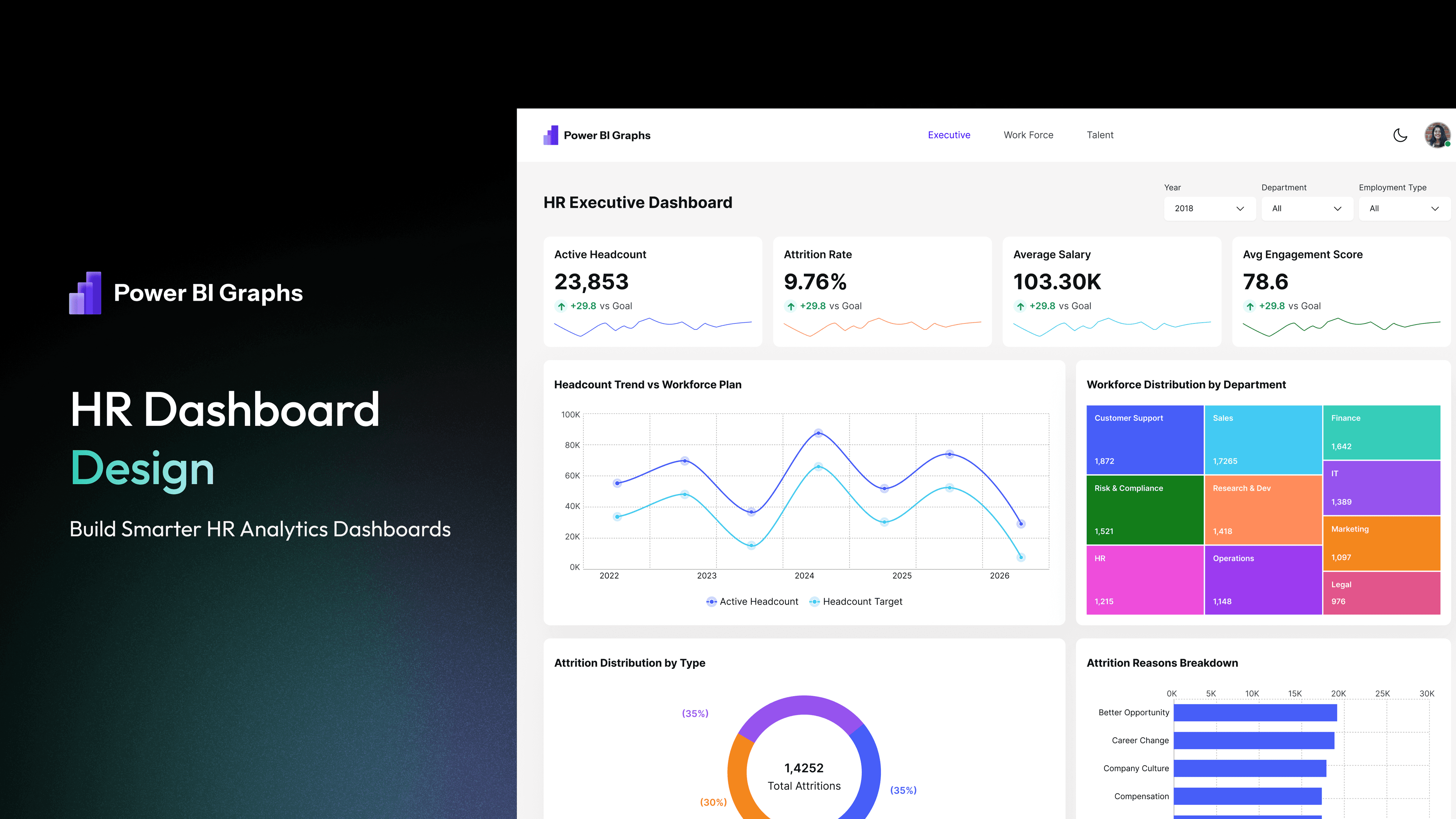
1. Build an executive summary page first. Leadership should see headcount, attrition rate, open positions, and diversity metrics in a single glance — no scrolling, no filtering required.
2. Separate strategic and operational views. A CHRO reviewing quarterly trends and a hiring manager checking today's pipeline shouldn't be looking at the same page.
3. Show trends, not just current snapshots. Attrition, headcount, and time-to-hire all mean more with 6-12 months of trailing context than as a single static number.
4. Apply row-level security thoughtfully. Design pages so that sensitive detail — individual compensation, performance ratings — is restricted at the data model level, not just hidden visually.
5. Benchmark wherever possible. Pair raw numbers with context: industry averages, internal targets, or prior-year comparisons, so users don't have to guess whether a number is good or bad.
6. Keep DEI reporting clear and respectful. Diversity dashboards should present data professionally and in aggregate, avoiding visual choices that feel reductive or overly granular at the individual level.
Real Examples
A mid-sized company we've seen built their first HR dashboard as a single page with eleven visuals: a full employee roster table, headcount by every possible dimension (department, location, tenure, level), and a compensation breakdown all crammed together. The CHRO reviewed it once and went back to requesting a quarterly PowerPoint deck from the HR analytics team instead.
The redesign split the report into three pages. The executive summary showed four KPIs — headcount, attrition rate, open positions, and average time-to-hire — each with a 12-month trend line. A manager page let team leads filter to their own department and see attrition risk indicators. A detailed analyst page retained the granular breakdowns for HR's own internal use. The CHRO started reviewing it monthly, and hiring managers began checking their own pages weekly — because each audience finally had a page built for them, not one page trying to serve everyone.
Common Mistakes
| Mistake | Why It Hurts | Fix | |---|---|---| | One page serving every audience | Overwhelms executives, underserves analysts | Layer pages by audience: executive, manager, analyst | | Headcount shown only as a static number | No context for whether it's a good or bad sign | Pair every core metric with a trailing trend | | Sensitive data visible without restriction | Creates privacy and compliance risk | Apply row-level security at the data model level | | DEI data displayed at overly granular level | Risks exposing identifiable small groups | Aggregate demographic data appropriately | | No benchmarks or targets shown | Users can't judge if a number is a problem | Add industry or internal targets alongside raw figures | | Inconsistent filters across pages | Slows down managers checking their own team | Standardize filter placement and behavior HR-wide |
Professional Recommendations
- Start HR dashboard projects with a stakeholder interview across at least three audience types — executive, manager, and HR analyst — before designing a single visual
- Build row-level security into the data model early; retrofitting it later is far harder
- Use consistent color logic for attrition risk (e.g., red/yellow/green) across every page so managers don't have to relearn the meaning
- Review DEI-related visuals with legal or compliance stakeholders before publishing broadly
- Revisit HR dashboards each fiscal year, since workforce priorities shift faster than most other reporting domains
Teams building recurring HR reporting often reach a point where designing this structure from scratch on every project isn't the best use of time. A purpose-built HR Dashboard template gives teams a proven starting layout for headcount, attrition, and recruiting metrics, while a broader Power BI UI Kit keeps the visual language consistent with the rest of the organization's reporting.
HR Dashboard Design Checklist
- [ ] Executive summary page limited to 4-5 core KPIs
- [ ] Manager-level and analyst-level views separated from the executive page
- [ ] Attrition and headcount shown as trends, not static snapshots
- [ ] Row-level security applied to sensitive compensation and demographic data
- [ ] DEI metrics reviewed for appropriate aggregation
- [ ] Benchmarks or targets included alongside raw metrics
- [ ] Filter behavior consistent across all HR report pages
Frequently Asked Questions
What KPIs belong on the first page of an HR dashboard?
Most executive HR dashboards lead with headcount, attrition rate, open positions, and time-to-hire, each shown with recent trend context rather than as isolated numbers.
How should sensitive HR data be handled in Power BI?
Sensitive fields like compensation and individual performance ratings should be protected using row-level security at the data model level, not simply hidden or omitted from certain visual pages, since the underlying access needs to be genuinely restricted.
Should HR dashboards be different for executives versus managers?
Yes. Executives generally need strategic trends and organization-wide summaries, while managers need operational detail scoped to their own teams. Designing one page for both usually underserves at least one audience.
Is it better to build an HR dashboard from scratch or start from a template?
For most organizations, starting from a proven HR Dashboard template is faster and reduces the risk of common design mistakes, while still allowing full customization to match specific KPIs and org structure.
Final Thoughts
HR dashboards carry more responsibility than most reporting use cases — the numbers behind them represent real people, and poor design doesn't just create confusion, it can quietly undermine trust in HR's ability to manage sensitive information well.
Designing with audience layering, trend context, and appropriate data governance turns an HR dashboard from a compliance obligation into a genuine strategic tool — one that gives leadership, managers, and HR teams the clarity they need to make better workforce decisions.